


Immi is a solution developed to tackle the problems young international students encounter when dealing with immigration to Canada for school.
Students are made to keep track of all existing immigration documents and its new information pertaining to their immigration status when they arrive Canada. I could personally identify with this problem as an international student, as I faced anxiety when handling immigration documents.
I conducted remote interviews with with 5 participants, with each of them lasting 30 mins. I wrote down quotes from the participants on similarly coloured post-it notes and created affinity maps out of them
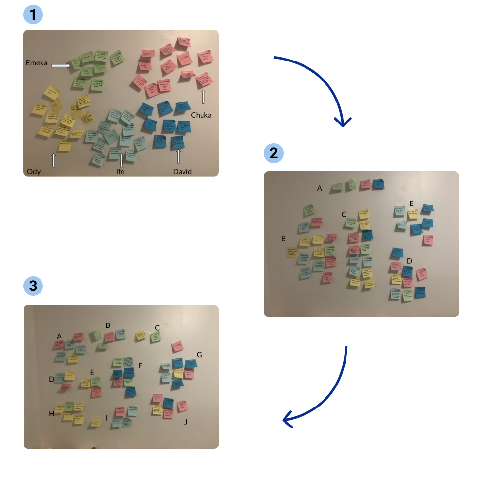
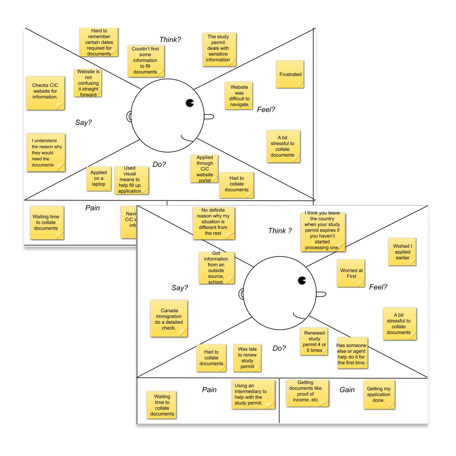
We divided the quotes into two groups of Empathy Maps which I called groups A and B. Group A; an older group, not worried about handling their immigration documents themselves in comparison to Group B , a less independent group which would prefer to have aid in handling immigration documents. Group B do not have enough information about the actual study permit process and are more comfortable using an intermediary in handling their immigration documents.
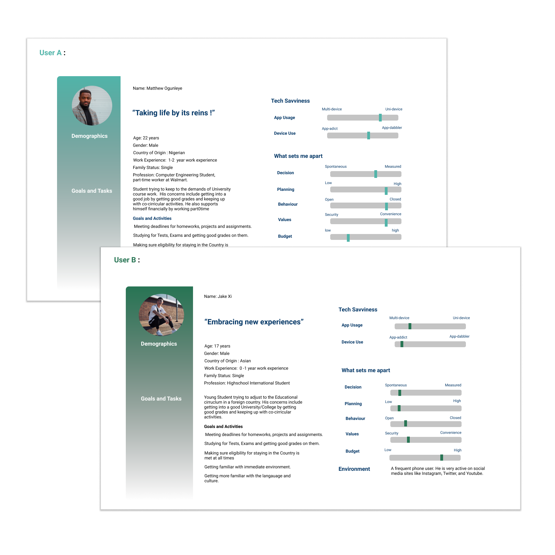
Settling and concluding on a target audience, this led to the introduction of 2 personas, User A and User B.
User A
User B
We were able to have a general understanding of the users and their overall relationship with the current application from the insights we had gathered.
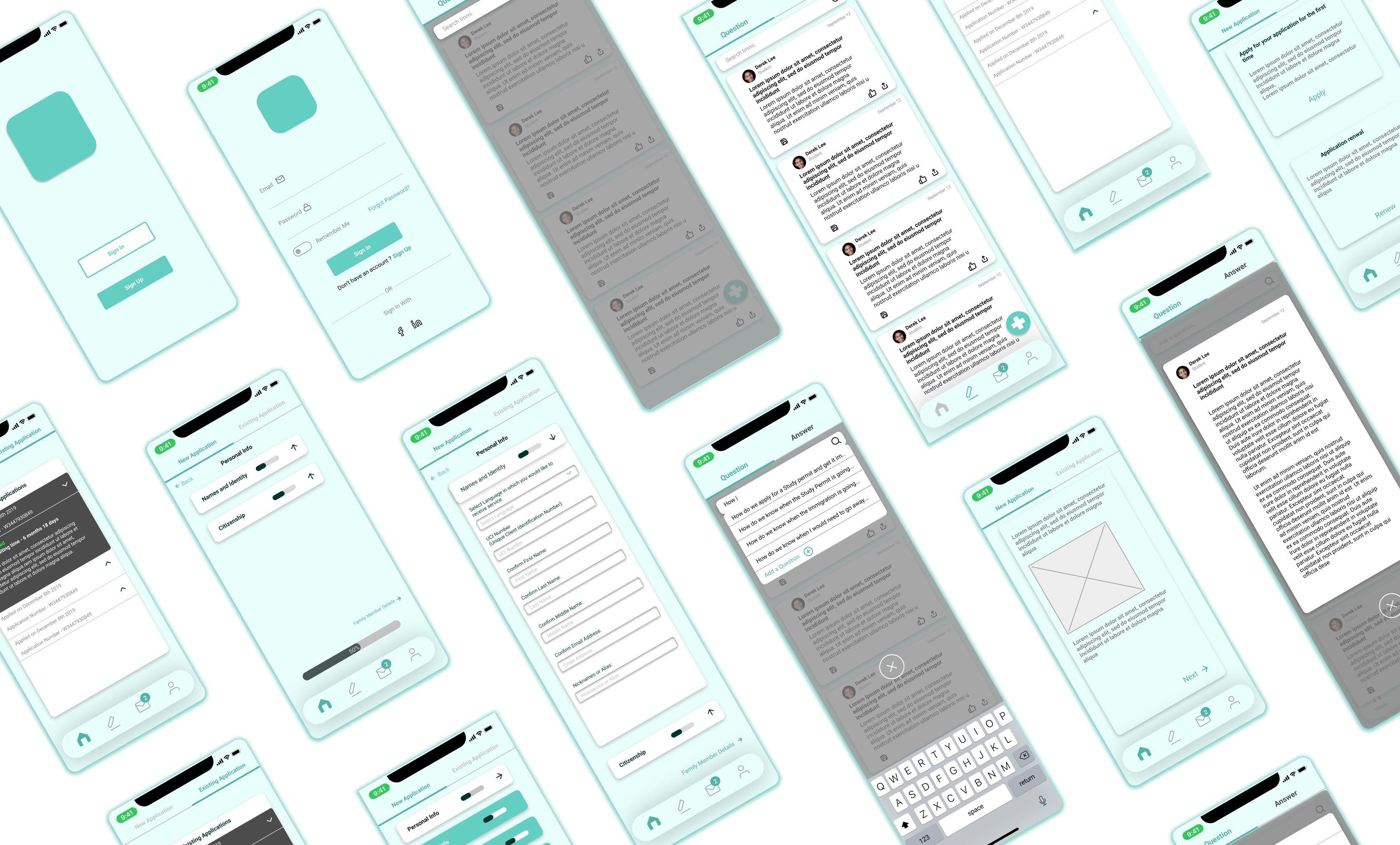
Using mobile-first design, there was a need to prioritize the most important features in terms of functionality and design elements.
Features to be sketched include:
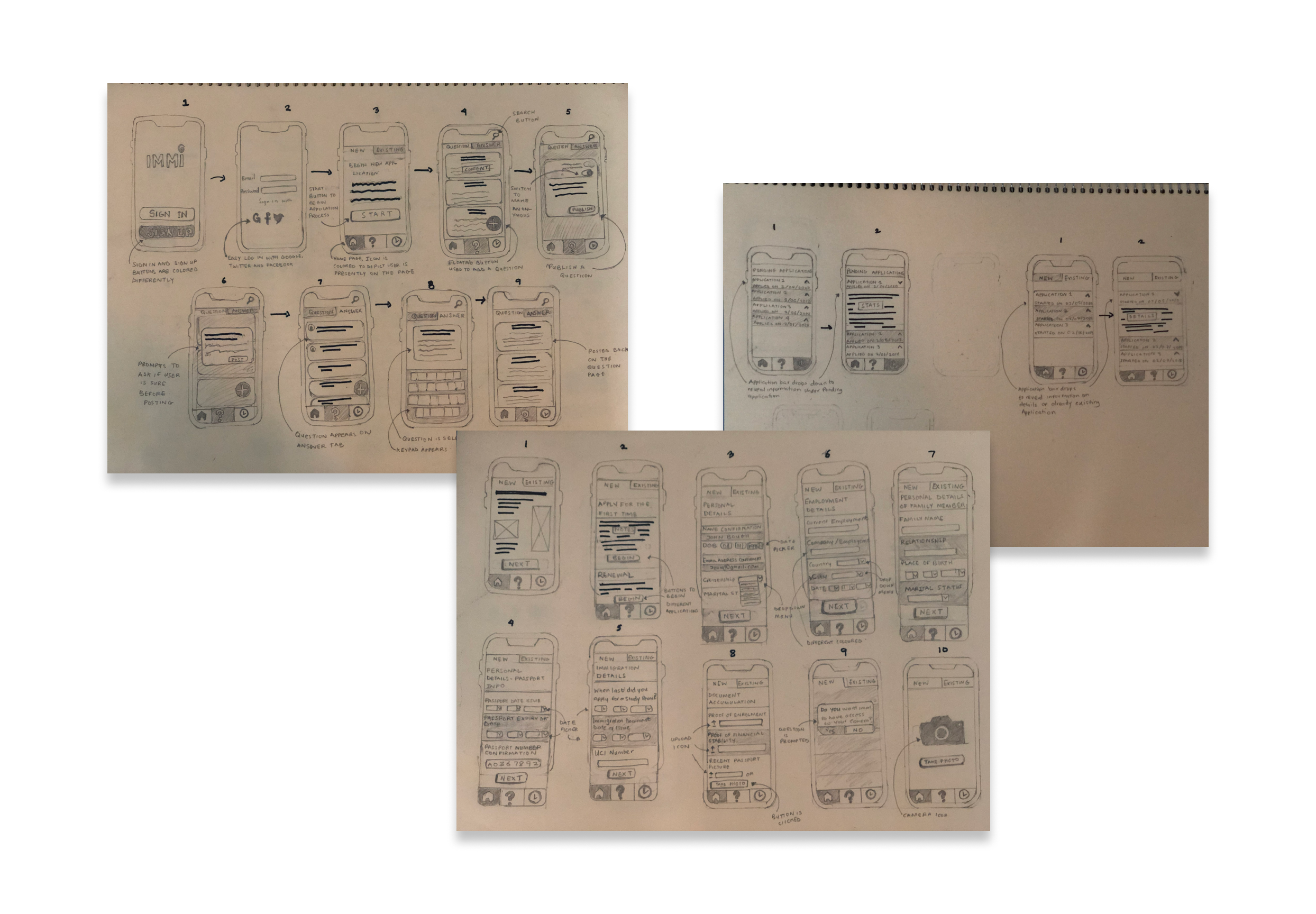
After creating the wireframes, I tested different user flows
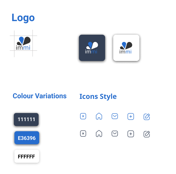
I chose the word " Immi " because it is a 2-syllable word that is easy to remember.
The Brand Attributes chosen were Honesty, Security, Efficiency, Compassion, Effortless.
Blue represents meanings of depth, trust, loyalty, sincerity, wisdom, confidence, stability.
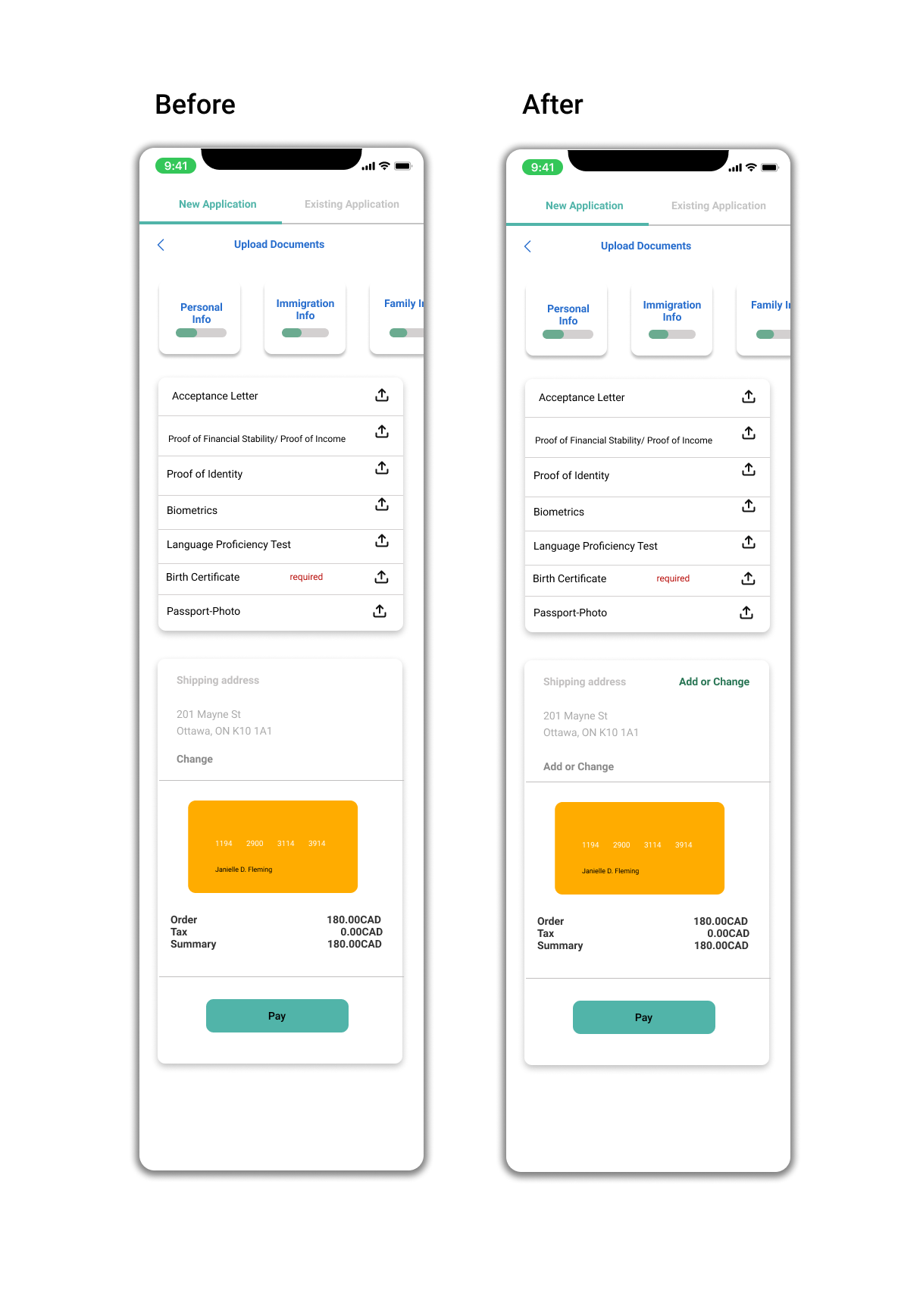
This was the primary feature of the application. Users should easily be able to fill up the the digital forms. The form is further divided into sections to make it further comprehensive for the user. There is a loading bar which depicts how much the user has achieved in filling up the form.
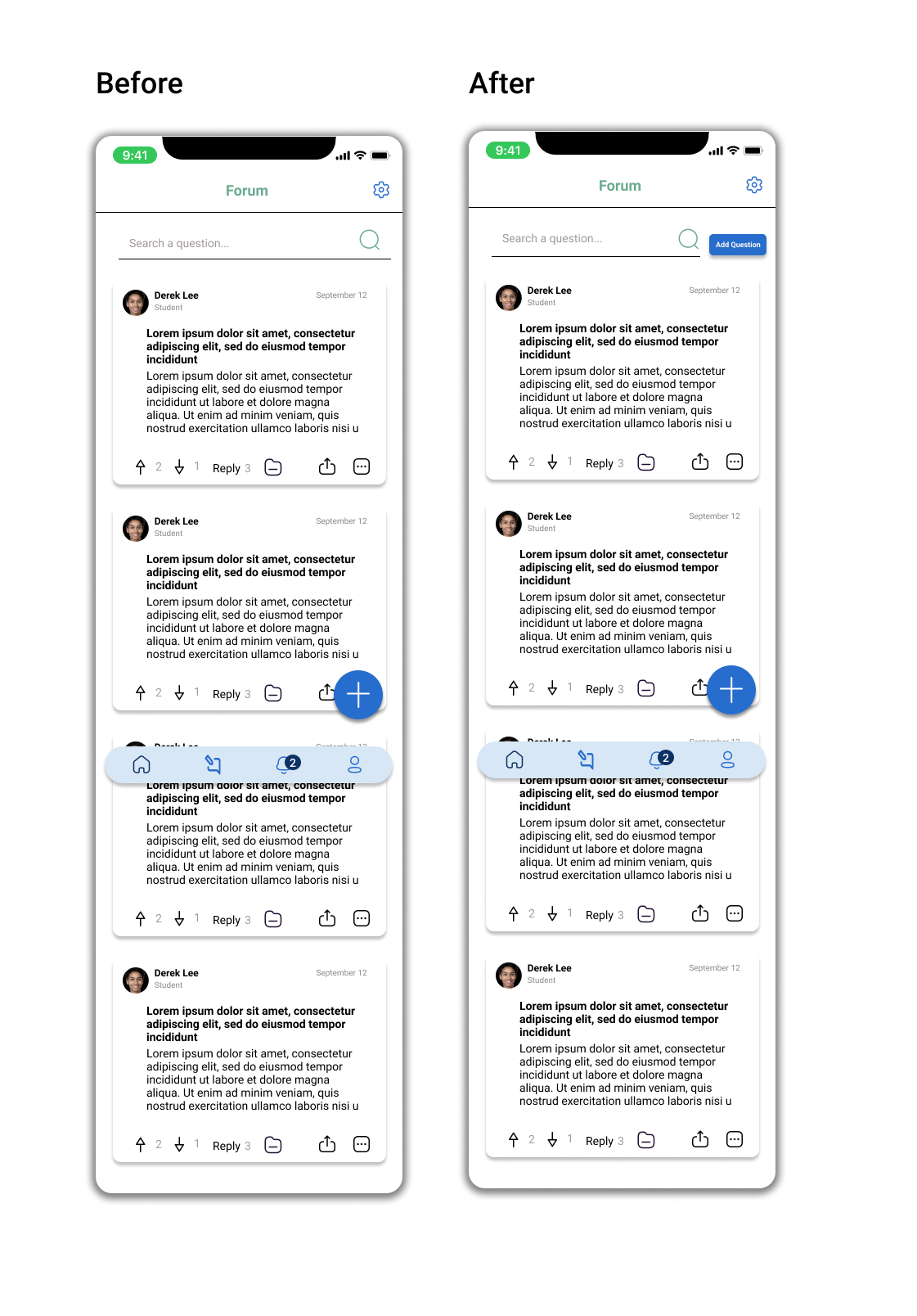
One of the major concerns initially was having a means to gain access to the right information regarding immigration policies. The forum feature enables user to ask questions and answer questions. The reliability is built within the community forum by using likes/dislikes of posts made by the users.
We wanted the users to have access to real-time update of their application process. The user has the ability to check the status of previous applications and also have an idea of how long it would take to receive a response.
With an application that requires constant and real-time updates on the progress of a user's application from the moment it begins till the end, a notification feature was deemed necessary for implementation.
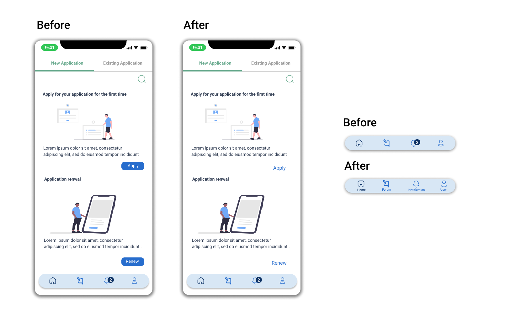
The apply and renew buttons were not accessible for some users. The link buttons were instead changed to large prominent buttons since it is a major CTA button. A bit of reluctancy to make this change because a 2nd time user would not have a similar problem of navigation. Words were included along with the icons for faster execution of actions as some participants took a little bit of time to find the forum page.
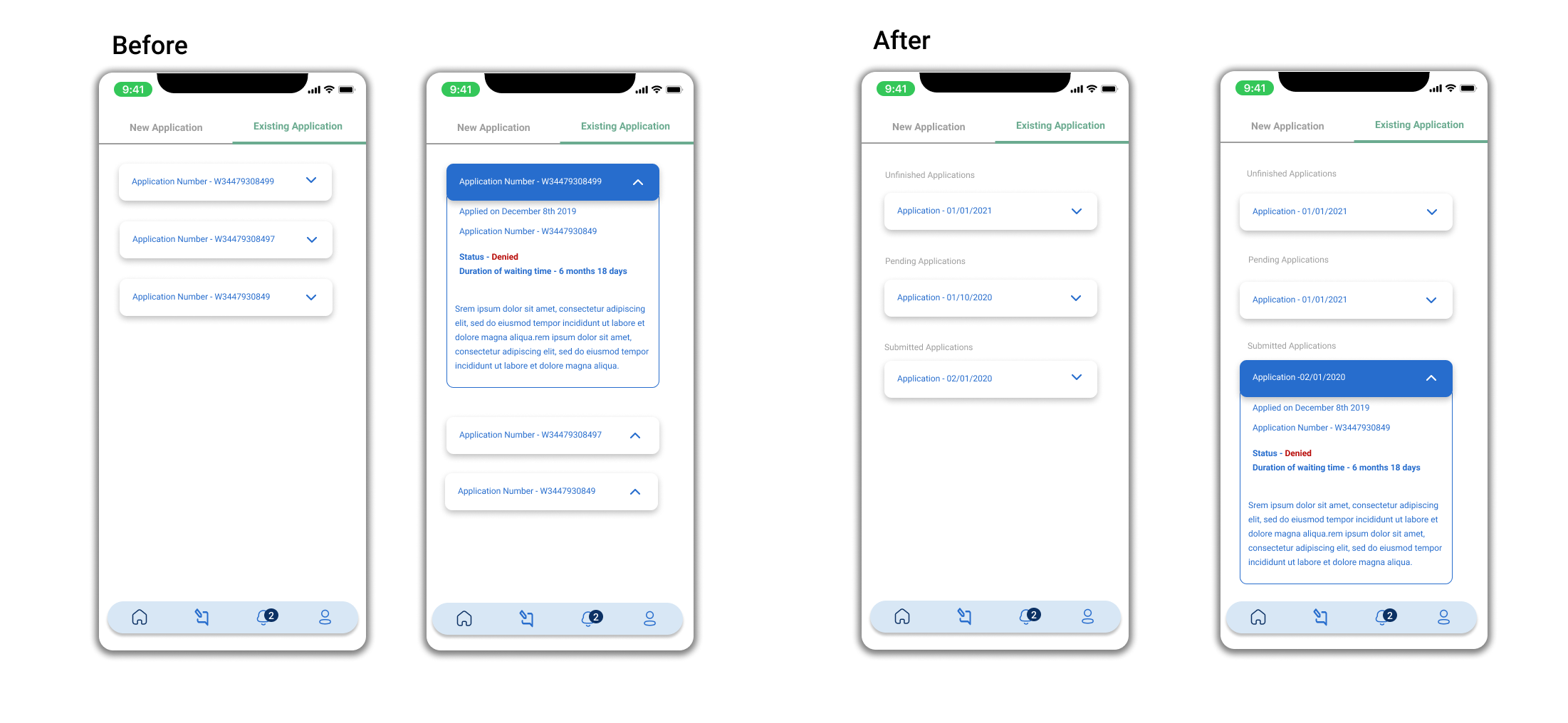
Applications are categorized into sections of unfinished applications, pending applications and submitted applications to enable users find applications faster.
The users should be able to ask questions quickly and easily. Each user took a bit of time glancing at the page before clicking on the big blue button. To cut the time short, another button with the “Add question” text was added to reduce the time taken to perform the action especially for new users.
Although a minor pain point, the button link was made more vivid to enable users quickly find where to add or change card information.
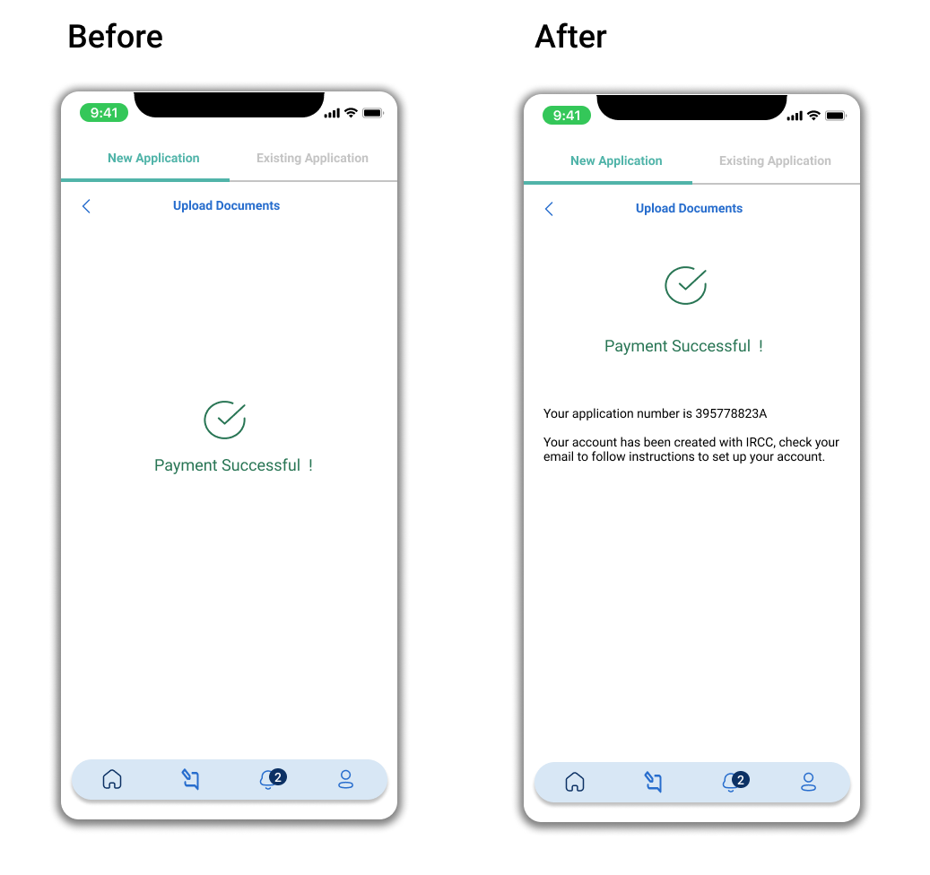
This was essential to implement because the user needs to know if their application process has created an account with the Canadian Government after submission of the filled up forms.
Ah, congratulations to myself, my very first full scale UX process ! This was a hypothetical process which gave me an in-depth understanding of the UX process.
With the time spent working through the application I had learnt a lot about the Canadian Immigration system. I learnt around dealing with people, interviewing, research and testing.
A lot of favourable assumptions were made in order to create the ideal study permit application but as a UX designer working with real application, certain constraints would limit the ability to re-create Immi.
Thank you for coming this far :)


